Graphical Analysis
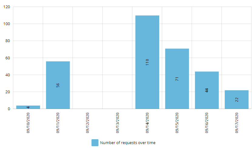
The following bar graph depicts the distribution of requests over time, matching your selected dashboard filters.
The Y-axis represents the number of requests, while the X-axis represents the time frame. The blue bars represent the request volume over time.
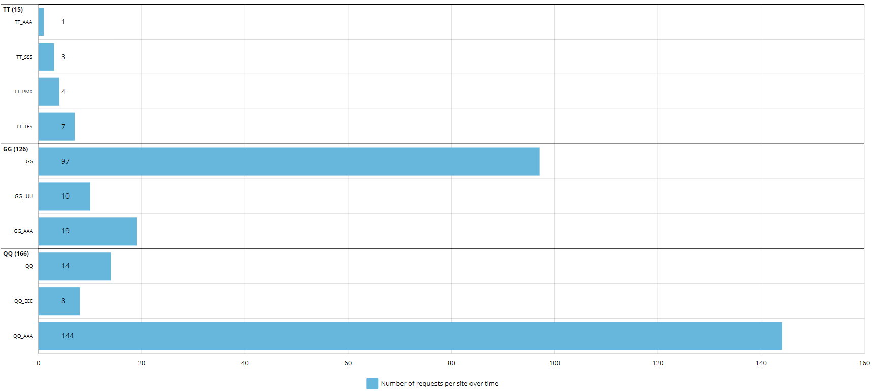
The following horizontal bar graph depicts the number of requests from site(s) over time, matching your selected dashboard filters.
The Y-axis represents the site(s) in the PDMP user's state, while the X-axis represents the volume of requests. The blue bars represent the distribution of request volume per site in the time period selected in the dashboard filters.